Make them see what you want them to see
This is the first post in a new series about tips on designing your website like a sneaky Jedi! All of the marketing strategies the Sparrow team has taught so far are dependent on having good design principles: things that look good and perform well. So, how do you get your audience to look at the things you want them to look at and read the words you want them to read anyway? Let’s explore that now.
CONTRAST
Sometimes people think they need to match their entire website to their logo, but that isn’t always the right move. Matching a blue font, blue page, blue background all because your logo is blue doesn’t work well for your user. Using contrasting colors gives you an advantage.
If you have the main button you want everyone to push a different color, it will easily draw the eye. Make sure when picking colors, it is directly complementary to your main theme of colors, which are found opposite on the color wheel. These new colors will jump out at your audience and will show them exactly where you want them to go.
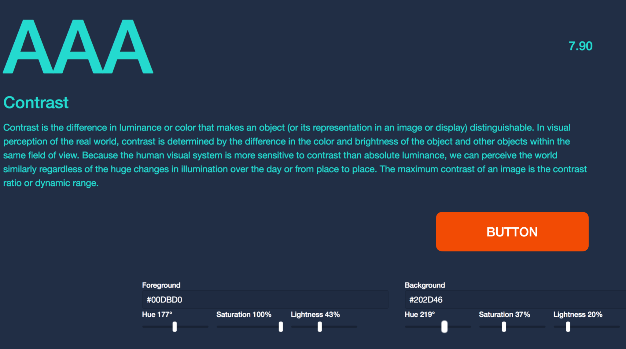
Contrast can refer to a few things, not just color. Font size in headlines vs. text is another great way to show contrast and direct the eye. It can make content easier to read and also visually tells them where you want them to end up. Other marketing strategies like the Z pattern which is how the eye naturally travels across a page, while more than valid, only apply to those using larger devices. When people are scrolling on a phone, however, you need your call-to-action (CTA) button to jump out.
HIERARCHY
It’s really important that when people land on your website that you know what people will read first and what will rope them in and touch their pain point. Through hierarchy, you can predict (and even better, direct) what path your audience’s eye will travel across your page: the hook (sharing the pain point, roping them in), a little about your company, CTA. The order is critical.
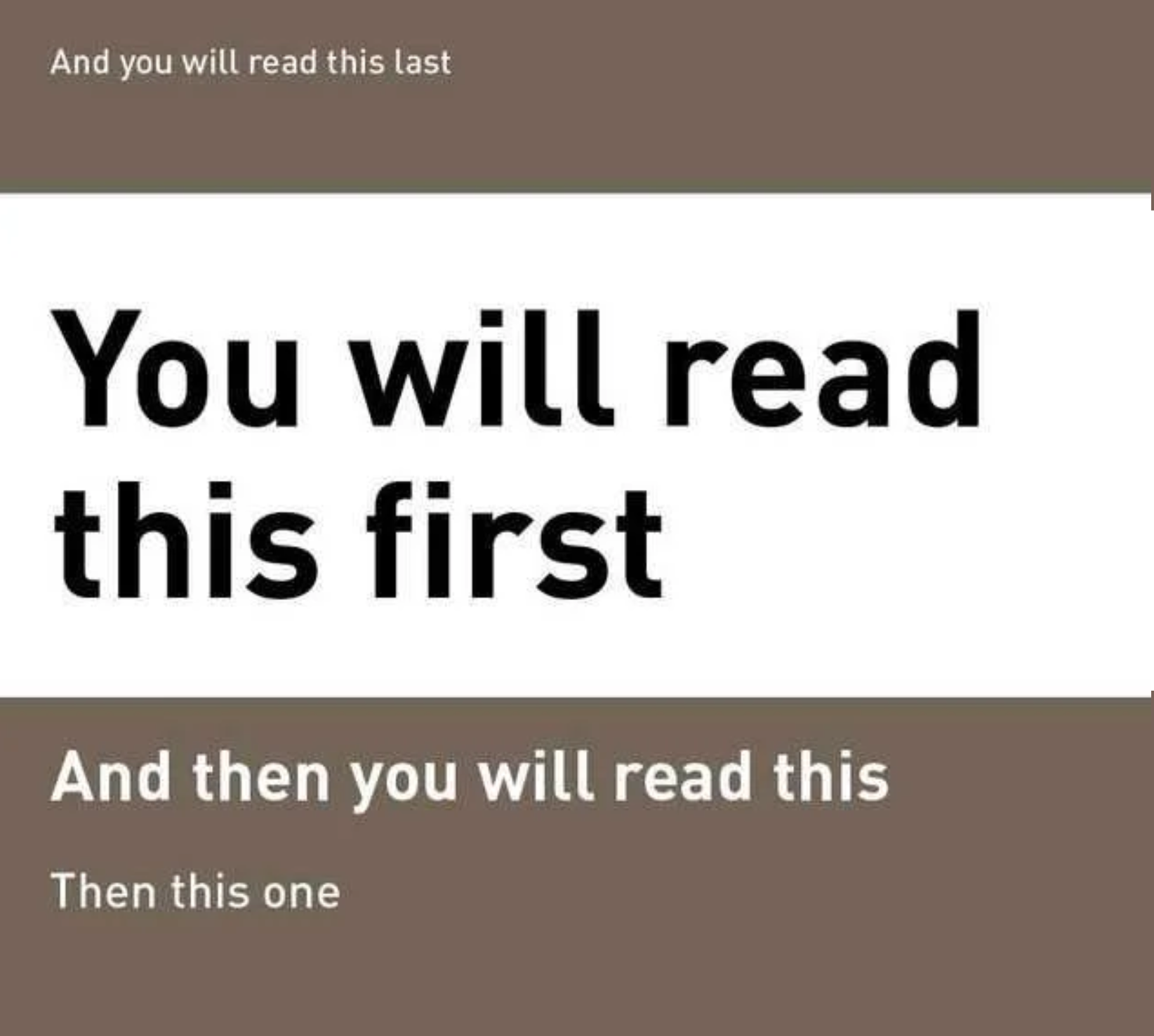
The size of your font is powerful. Make your headlines super large and then the rest of your text readable, but much smaller. Since your headlines are read first (and sometimes the only thing), create them with deeper content. Most people won’t even read the rest of the page that your team labored over… so make your headlines count.
WHITE SPACE
The law is that “white space” isn’t always white space. It simply refers to the space you’ve allowed around your text. Think of it as a cushion or the space that your text is floating in. White space does two things:
1. Makes your page NOT stressful (you need paragraphs around your headlines, between your paragraph, around your button). Think of cereal boxes or magazine covers. They’re not crammed with lots of stuff. They use big space as buffers around each element. A large image and maybe three elements of text. Bad white space is where you’re reading and hope your dyslexia doesn’t kick in.
2. Gives a breath. People want to scroll and then read, scroll some more, and then read some more. That breath is necessary to take, but they WILL come back and stay interested if you don’t cram them with every inch of square space.


ALIGNMENT
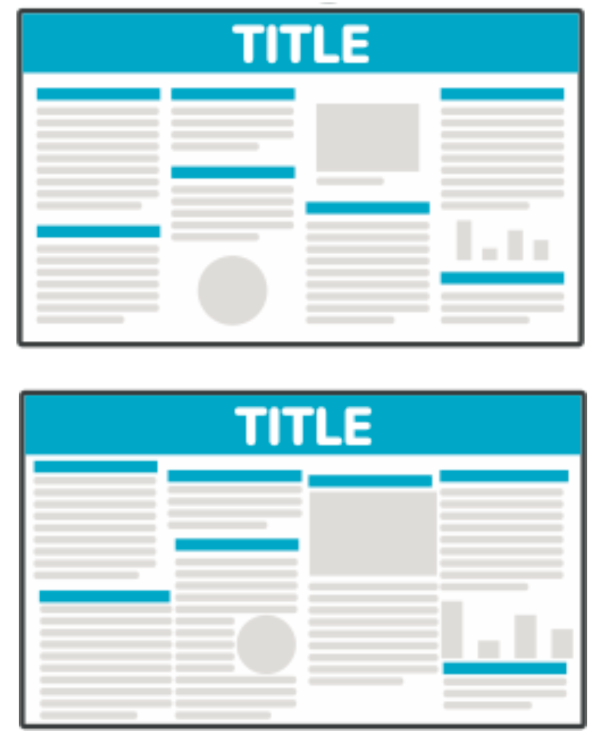
Make sure your paragraphs, headings, and graphics flow from section to section in tidy boxes. Without that order, people’s eyes will haphazardly jump around your page simply due to poor design. There are times to write things for the space you have available on the page to make things fit a little better.
VISUAL CUES
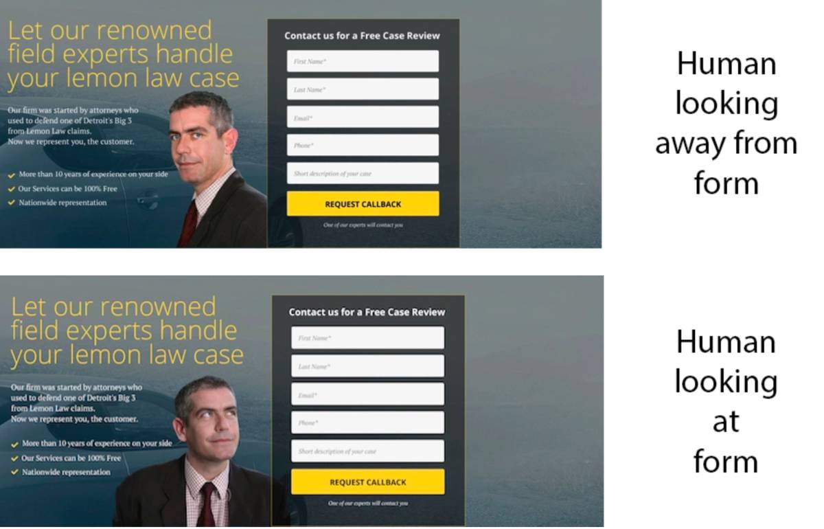
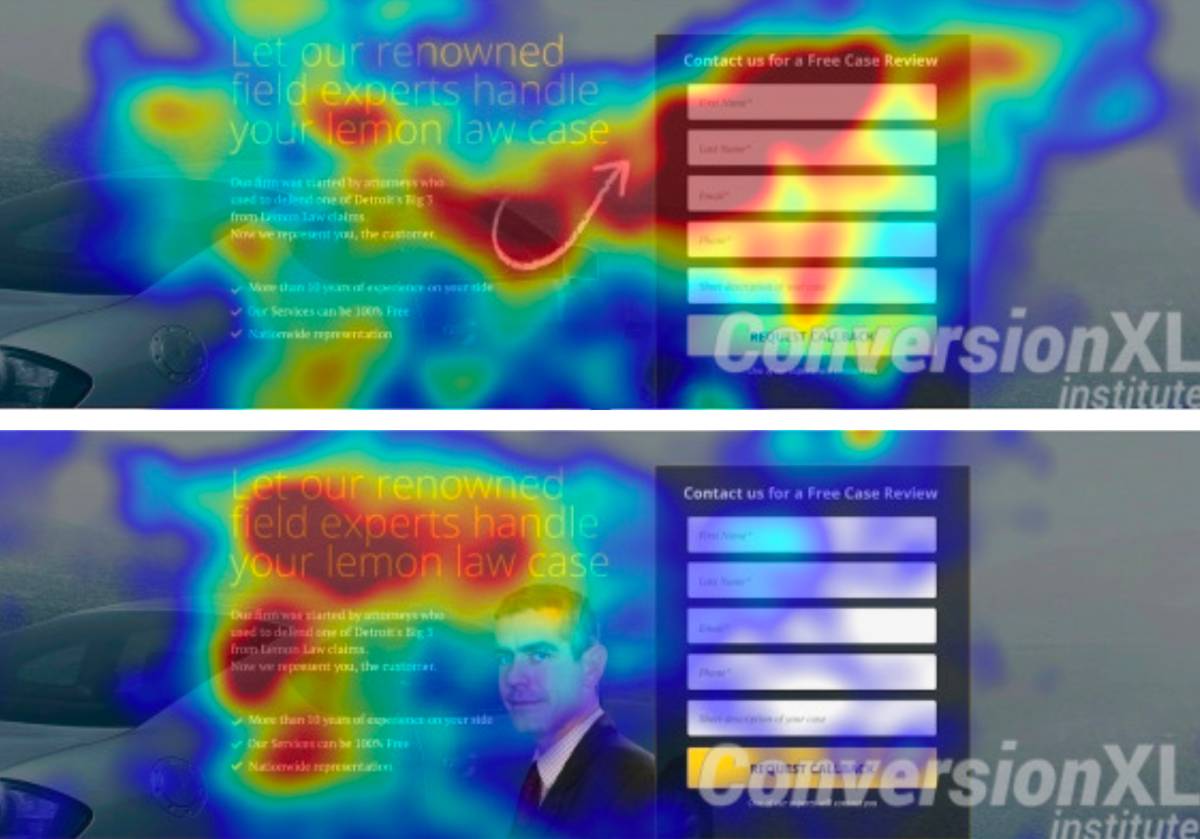
Do visual cues make a difference? Directing someone’s eye with the gaze of your stock photo or with arrows is extremely effective in directing your audience’s gaze where you want them to go.
Next time you’re designing an ad or email, consider keeping these five design elements in mind to capitalize on keeping your audience engaged and interactive on your website.


