In Sparrow’s LaunchKits, we’ve created a basic template for you to design a Landing Page. In order for you to make the best use of your LaunchKit, we thought explaining exactly what they are and how to set them up would be helpful. You can hear Adam explain it himself from a past recording of a strategy session!
If you want to keep reading, we’re going talk about the same things and cover what a landing page is, how to create an effective landing page, and where to start.
WHAT IS A LANDING PAGE?
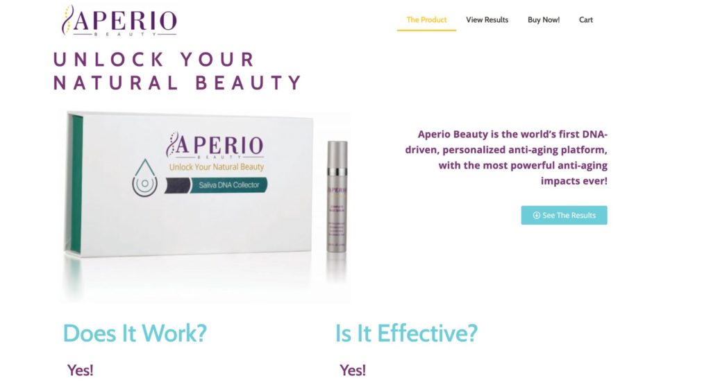
The most simple explanation is that a landing page is a page with a single objective. They are specifically designed to promote a single focus, which we typically refer to as a Call to Action (CTA).
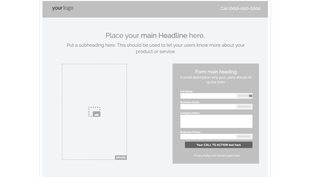
For example, if you’re working on promoting a lead magnet for people to sign up for, your landing page is a spot to focus on that goal alone. It doesn’t take them to the home page on your website, but to a special spot just for advertising your “Limited Time Offer.”
When creating a landing page, you need to understand that once your potential customer arrives, you only have 5 to 7 seconds to answer their three most burning questions, which are:
- What do you offer?
- How will it make my life better?
- What do I need to do to buy it?
If your lead magnet takes them to your main website page which tells them about your company and all the services you offer, instead of honing in on what drew them to you in the first place (the awesome deal you advertised), you will likely lose their interest. Instead, when someone clicks on your lead magnet, it should take them directly to a landing page designed to answer those three burning questions they have about your product or service.
CREATING AN EFFECTIVE LANDING PAGE
1. Headline Copy
Headlines are a way to directly connect to your audience in an emotional way. It must reveal their hidden desires or highlight a pain point in order to effectively convince them to follow your CTA command.
2. Calls-to-Action
Rather than creating a button that generically suggests they SUBMIT or LEARN MORE, change the text to directly correlate with what you’re offering, like “GET MY 10 TIPS NOW” or “FREE CONSULTATION”.
3. Form Layout
When designing your contact form, it’s easy to fall for one of these mistakes:
- Too much information
Forms that require lots of information from your potential customer make them lose interest fast. They’re in a hurry. They won’t take the time to fill out name, company name, address, phone number, email, open-ended questions. Don’t make them work too hard.
- Too little information
While too much information will drive people away, too little information doesn’t give you the qualified lead that you need to pursue them further. Ask them for their name, email, and phone number; but also ask a yes/no question, like “Are you ready to get started now?” or “How do you prefer to be contacted?”
- Body Copy
As found in the StoryBrand method created by Donald Miller, you need to be known for solving a problem. Figure out what kind of pain your potential customers are experiencing, whether externally, internally, or philosophically. Your job is to really push that pain hard so that you can show how your business will solve all their problems.
- Page Layout
How you design and order the page totally matters. Below you’ll see a checklist of tips to keep you going in the right direction as you work on designing your landing page.
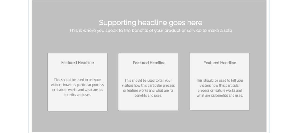
These are the eight keys you need to design your ideal landing page:
- Keep it simple: creativity and cleverness reduce its effectiveness
- Big, bold headline: highlights the pain of the customer
- Secondary headline: how you can resolve their problem
- Body copy: explain quickly but give more details about what you offer
- Social proof: testimonials or screenshots of 5-star reviews, badges, certifications, etc.
- Clear CTA: (bright orange… have it stand out from the rest of the page as seen in our ninja design tips blog post!)
- Make it a longer page: have them scroll to see images “below the fold”
- Answer FAQs: make sure you answer their burning questions first, but don’t forget to go into more detail later down the page.
WHERE DO I START?
Even though there are places that will create landing pages for you, such as Leadpages or Unbounce, they can be pricy. Sparrow created their LaunchKits to have this feature available for you to design easily in Elementor. If you still feel unsure about your skills, Justin created a Design Boot Camp that gives step-by-step instructions for using the program. He also shares lots of design advice for creating great landing pages that will effectively draw your audience and encourage them to become loyal customers. If you’re interested in this resource, please let us know.