As you create ads on social media, it’s important to create a related landing page for your audience to interact with and be compelled to give you their information. A landing page is simply a page designed to promote the offer someone found interesting an ad they saw on social media. It is not a page with all your company details or menu options to take them all over your website. Its only job is to make them an offer they want so badly they are willing to give up their personal information and become one of your leads.
You can begin this process on your home page because a lot of the elements you’ll want are already there. When someone clicks on that ad from your social media platform, you’ll want them to arrive on a page that shows them exactly what they were interested in having. This landing page describes the one service or product, shows your one offer/coupon/discount, and presents them with one decision or action, your Call to Action (CTA).
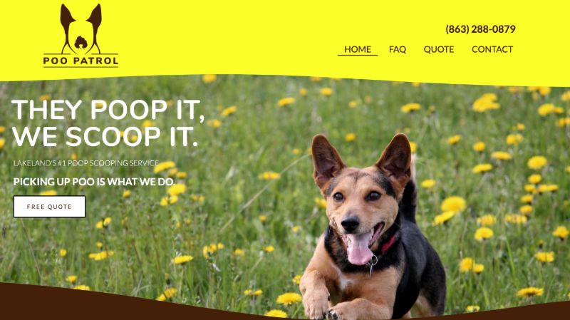
These next steps take you through all the things you need to change to turn your home page setup into a killer landing page:
1. Your heading should be directly attached to the ad with location markers or any other specifics. Make it consistent with what brought your audience to the page so they don’t get confused and think they’re in the wrong spot.
2. Whatever attracted them to this ad is also what they are finding on this landing page. Add a sub-heading that ties in where they saw the ad (from Facebook, for example).
3. Adjust all your CTA buttons by adding an anchor link (ex: #go) to scroll all the way down the page to your contact information. Change the text on the button to tell them what they need to do (“Get my quote now”).
4. Make sure the copy and the elements on your landing page are relevant to what they need to know. Don’t bombard them with too much information. Eliminate the excess items (areas of service, FAQs, etc.) that are on your home page because it will only distract them from the main point of why they came.

5. Create a form to gather up their personal information so you have a lead. You should be asking for no more than five blanks to fill in (name, email, phone) and post a guarantee to create some trust.
6. Options after they submit their form are useful. It can redirect your audience to the scheduling page and send you an email as a heads up.
7. Check your other devices to make sure they look just as nice on mobile. Since it was originally your home page, it should be pretty good; but just check to make sure everything works together.
8. Hide or customizing the headers and footers on the page. All you want your visitors to do is contact you for a quote, so taking away the distractions will help them stay focused on the goal. You can take away most of the options by only giving them an option to call, but no other menu options.
9. Make sure you hide the landing page so that Google doesn’t follow the links and reveal them to people who weren’t meant to see it.
Do you want to see step-by-step instructions on how to make these changes in Elementor? Check out our videos so you can watch Justin do it all in real-time!
Thanks for sticking with us. We hope you find these tutorials helpful in making the most out of your Launch Kit. As always, if you have any questions, please contact us.


